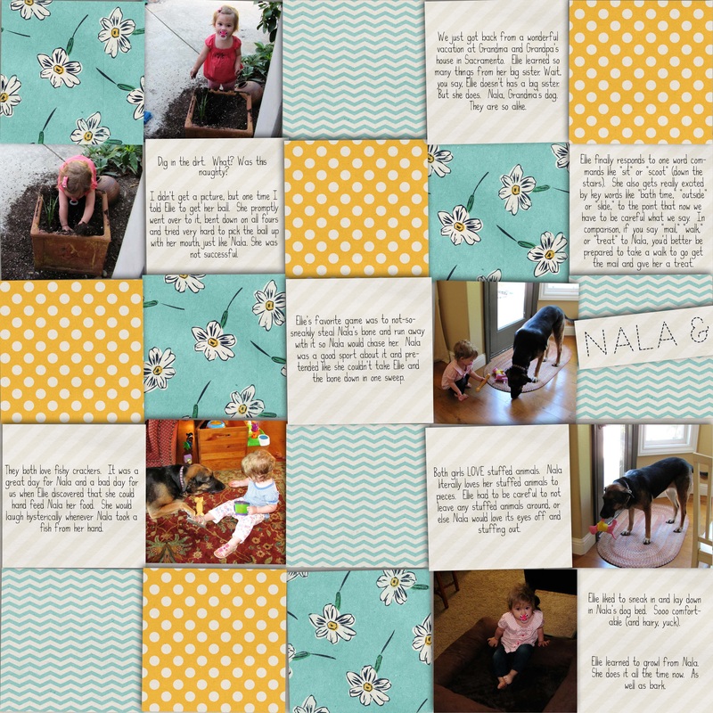
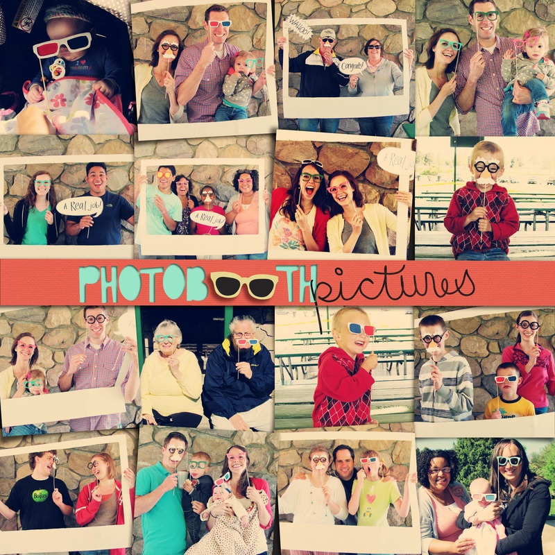
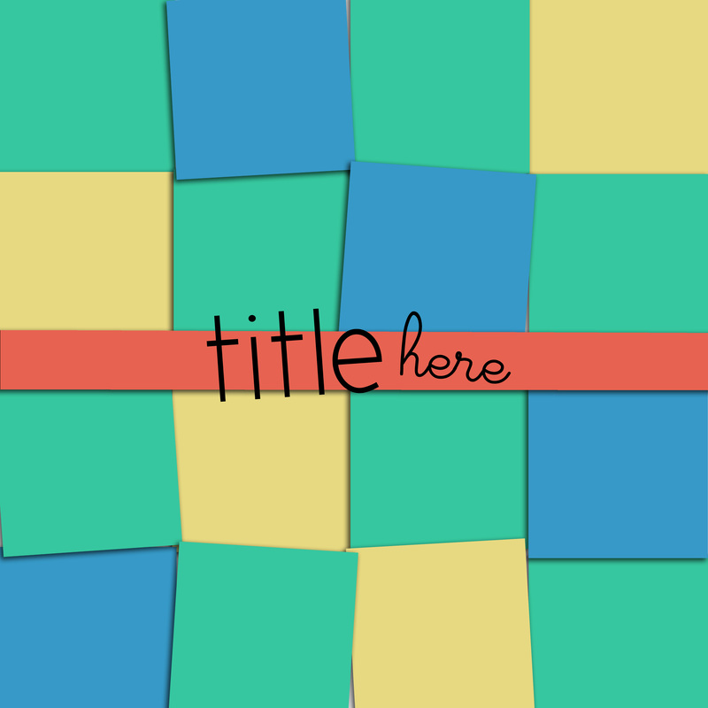
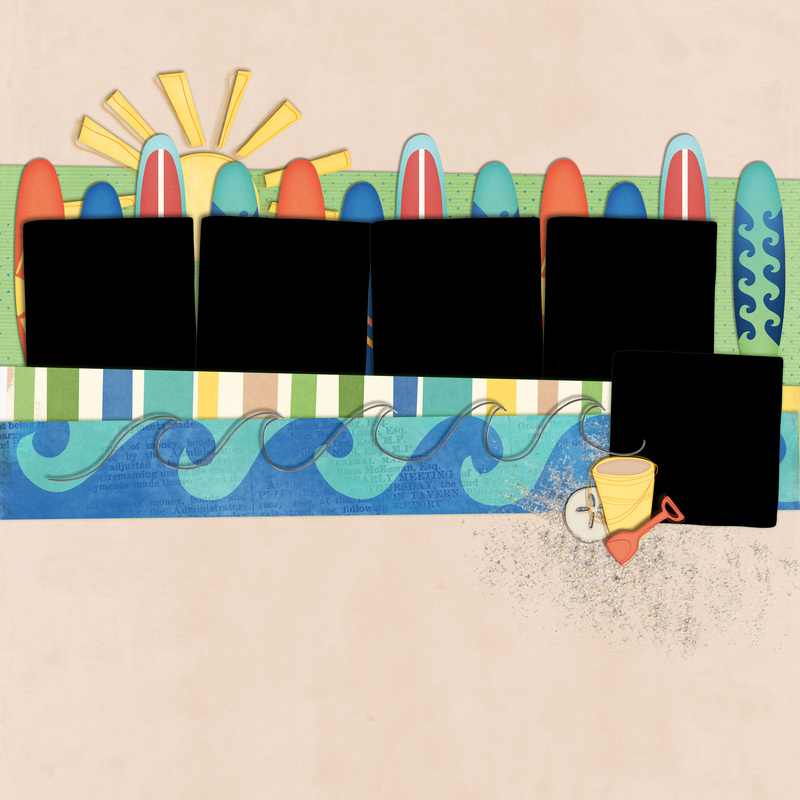
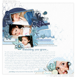
I'm soooooo close to the end of another book. Our days in Memphis are over, so the book containing layouts from those years is almost done. Almost. I just had a couple of random photos to put together and I felt so uninspired. Then I remembered seeing lots of layouts like the one below. It uses tons of photos, but still has some style to it. Great for as "catch up" layouts.
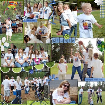
the inspiration--found through Brittish Designs
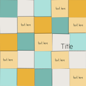
I turned a couple of my "catch up" layouts into templates for you to download below. My layouts aren't perfect, they aren't my favorite layouts, I may not even really like some of them, but bing batta boom, done. Sometimes done is better than nothing. (I also included the page I did with the California Dreamin' kit as a quickpage)
| |
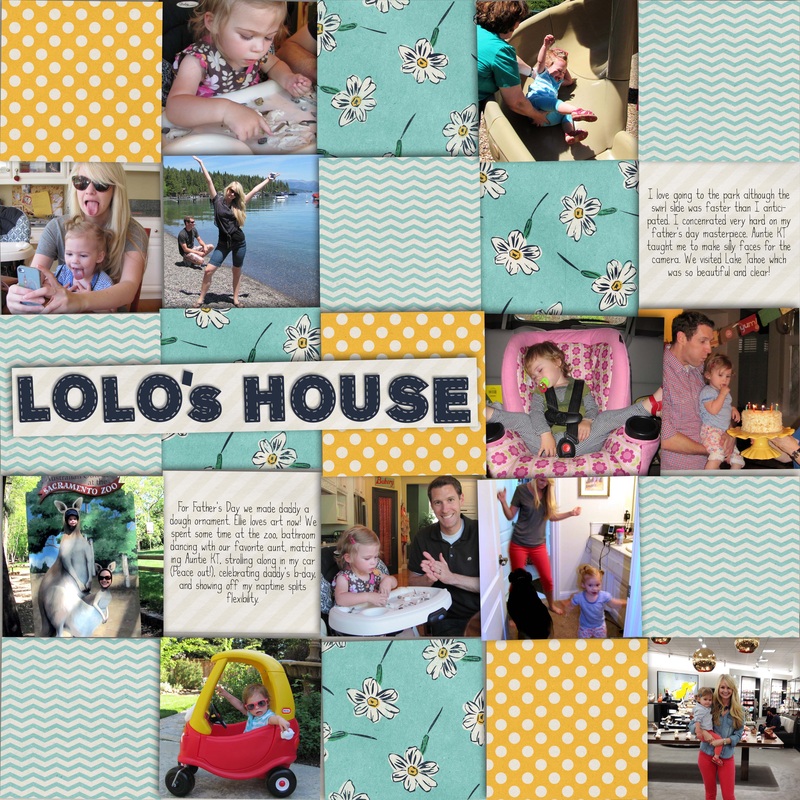
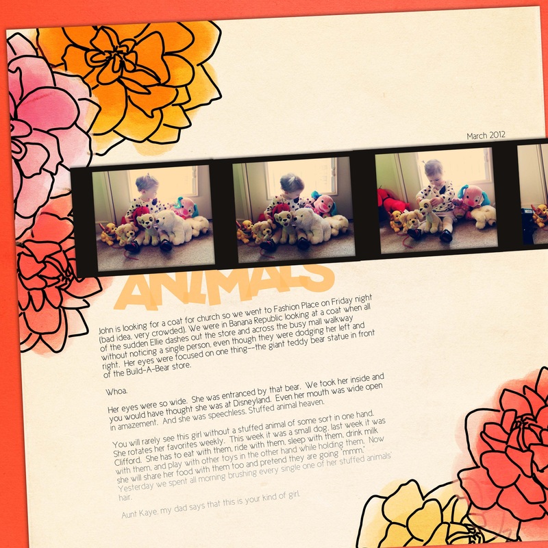
Normally I would spread the photos out evenly across the pages, but the photos on the other page went with a blog post I wrote.
|
Ombre is everywhere now. At first I didn't like it, but now I'm seeing things that make me like this trend more and more (except for some listed below). I've been planning on doing this post for a while, and then last week Shabby Princess did a post on the same thing!!! Dang you idea-stealing Shabby Princess. Anyways, their article is good, find it
here. If you don't know what ombre means, it is a shading of dark to light (or light to dark). And once you know what it is, you will see it everywhere. Just look at Pinterest or Anthropologie.
As with all trends, moderation is key. There are two types: blocking of the colors and an actual shading of the colors like when dyeing something. I tend to like the first one the best, but that's just me.
I'll illustrate with photos I pinned on my pinterest board (I promise to not hate you if you like some of the no's):
yes!
 This is not moderate per se, but it still blends in the environment. And the colors are fabulous! yes, I want!
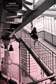
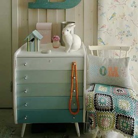 I love the dresser! I've also seen staircases that are tastefully done. Adds some flair, but still blends with everything else. | no!
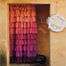
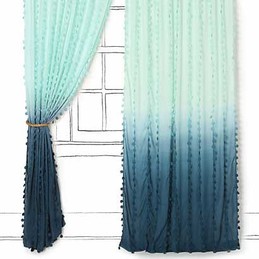 I think this is too overpowering for a room. Interesting to note that both curtains are by Anthro. heck no!
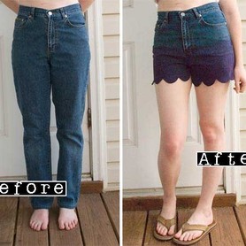 This was actually repinned by lots of people. I think it looks too hippy-ish. Ombre can look hippy so watch out when using it. Also, why the grandma jeans? |
ok
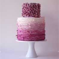
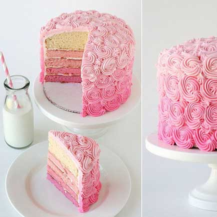 Too much ombre. Choose either ombre frosting or ombre inside. Both is overkill. | better
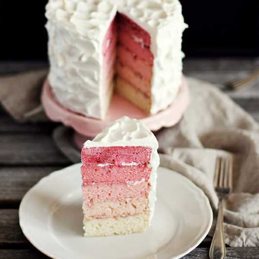 It's a normal cake, and then...surprise! Ombre inside. | best
 This takes the trend and makes it look classy and elegant, although I probably wouldn't choose mauve. |
Ombre can add some spice and trend to your scrapbooking layouts. In moderation. You don't want to look back on these pages and say, "those were so 2012." Here are some ways to add a little ombre flair to your layouts. Notice again that I said a little. Choose one thing--two or more types would be overkill.
With papers and elements...
Love how subtle this is! She searched for blue papers and elements that matched, but you can do it faster by recoloring (and use any paper or element you want)! Check out my recoloring tutorial under the
Tutorials tab.
...in the journaling...
She did rainbow text, which isn't ombre, but you get the point. I think ombre journaling would be really cool. Find this layout
here.
...as the background...
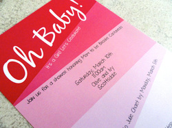
Use a bold ombre background paper, but remember to keep everything else (black and white photos, text, title) simple. Find this invite
here.
...on the photo.
If this were the only photo on the page and you were using a minimalist style layout, I think this could look fun. Find the tutorial
here.

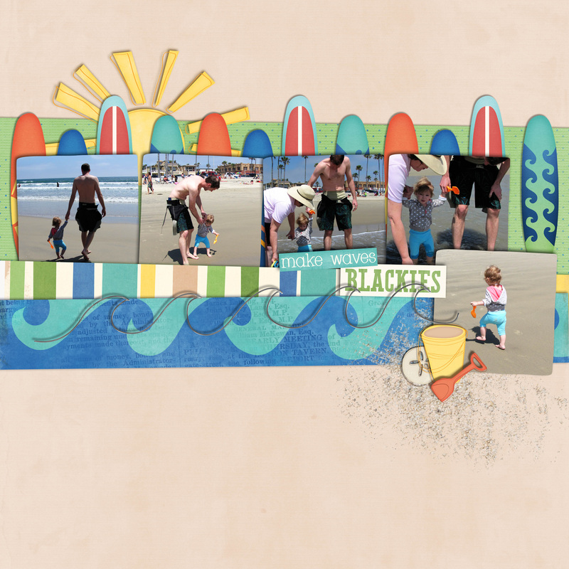
Here's my attempt at ombre. The background paper used a little of it, so I stuck with an ombre black for the text to make it less ombre overkill. I used papers from my spring kit (coming soon) and Color Me Spring alpha found
here. The font is Cicle. I would like to see the amazing ombre layouts you create! Email me to put your layouts in the Gallery (it can be ombre or not, I know everyone would love to browse your work for inspiration)!